Currency Strength Charts
Understanding currency strength charts is essential for trading using a currency strength meter. Charts show trends in the strength of currencies and highlight important momentum shifts that occur during a trading session.
Currency strength meter charts are particularly useful around economic news events. For example, a sharp fall in US dollar strength may occur following the release of lower-than-expected US Non-Farm Payrolls data.
Furthermore, currency strength crossover points frequently signal a good time to open a new trade or close an existing position.
After using currency strength for a while, you’ll also notice certain currencies tend to track each other (e.g. AUD and NZD). Any divergence is usually short-lived and may represent good trade opportunity.

The Basics - How to read a Currency Strength Chart
Currency strength charts have a similar structure to standard Forex charts.
The time-scale is on the horizontal axis. The timezone is typically adjusted to match your Forex chart’s timezone. Currency strength is reported on a scale of 0 to 10, with values less than 2 considered very weak and those above 8 very strong.
Each currency is plotted as a color-coded line. You can hide or show any of the 8 currencies.
Currency strength charts have a selectable timeframe which adjusts the duration of the measurement window. The most commonly used currency strength meter timeframe is “Daily” representing currency strength over the previous 24 hours. This timeframe is effective for intra-day Forex trading and is good at identifying momentum shifts during a trading session.
Example - Currency Strength during US trading session
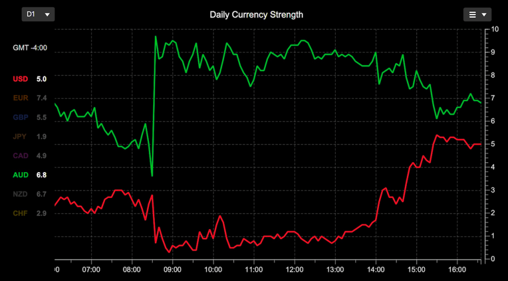
The chart below is a simple example of currency strength during the US trading session. The timezone is set to New York time (ET).
The US stock market opens at 9:30 (ET), with pre-market trading starting around 8:00 (ET). The stock market closes at 16:00 (ET).
The chart shows a large spike in AUD strength and USD weakness at 8:30 (ET). This occurred following the release of US CPI data that was weaker than expected.
| Release Time 8:30 (ET) | Actual | Expected |
|---|---|---|
| US Core CPI m/m | 0.2% | 0.3% |
| US CPI m/m | 0.0% | 0.1% |
| US CPI y/y | 3.3% | 3.4% |
Interestingly, AUD was impacted the most by this US CPI data. The other currencies (not shown) were not impacted nearly as much, presumably because traders viewed AUD as a higher-yield currency given the softer US CPI number at least in the short-term.

This chart suggests that the AUD/USD is the currency pair in-play during this session e.g. short AUD/USD. As the trading session progressed AUD weakened and USD strength returned to near baseline levels.
This simple currency strength chart example provides lots of crucial information to help trade the US session:
- Shows the impact of this US CPI data on the US Dollar. In this case, it initially weakened even further
- Reveals which currency (other than USD) is impacted the most i.e. AUD.
- Directs attention to the in-play Forex pair, in this case AUD/USD
- Recovering USD strength can be used as a signal to exit any AUD/USD short position.
Currency Strength Crossovers
The crossing of 2 currency strength lines can provide a useful signal to enter or exit a trade, especially after an economics news event.
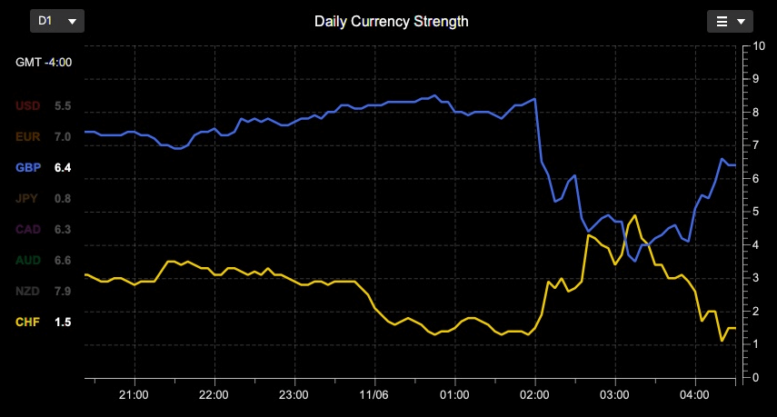
The chart below shows weakness in the GBP following the release of higher than expected UK Claimant Count Change.
| Release Time 2:00 (ET) | Actual | Expected |
|---|---|---|
| GBP Claimant Count Change | 50.4K | 10.2K |
As you can see from the currency strength chart, GBP was quite strong leading into the report. The weakest currency was CHF.
After the Claimant Count Change came in worse than expected, GBP strength fell as expected.
This report is not hugely significant, and the chances of a reversal is high. The difficulty is knowing which Forex pair to trade and when to enter. This is where currency strength charts can help.

The first step is find the best pair to trade. The goal is to find a Forex pair that will move the most with any reversal that occurs later on. Given that GBP was strong leading into the report, it’s best matched against a currency that was very weak. In this case, CHF was very weak before the report. So the GBP/CHF pair is a good candidate.
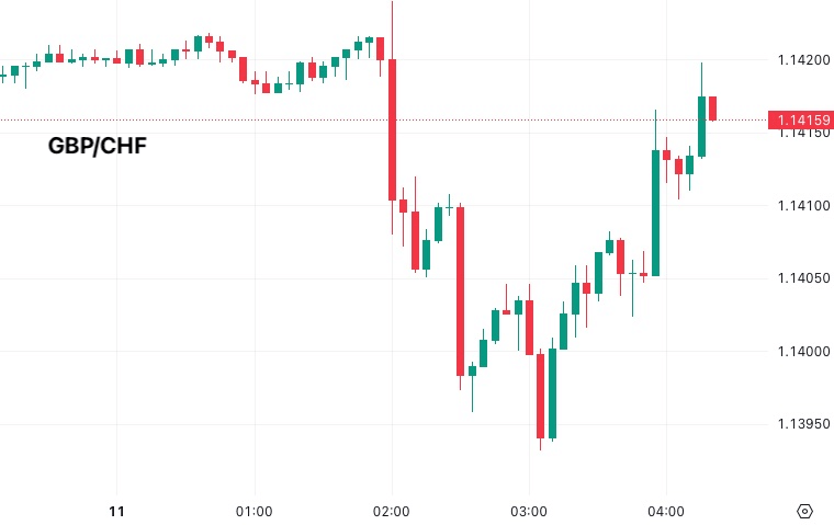
The next question is when to enter a long GBP/CHF trade. At around 3:15 the GBP strength crossed the climbing CHF strength line. This was a good entry point since both GBP and CHF were extended from their pre-news levels. The chart below shows the price action on this pair

The chart shows GBP/CHF moving up after 3:15 as GBP regains strength and CHF becomes weak again. A good place to exit would be when CHF or GBP strength returned to pre-news levels e.g at around 4:20.
Of course any trade can fail, so it’s important to enter with a stop loss and adjust lots sizes so any trade failure will only have a small impact.
Key Takeaways
- Currency Strength charts are essential for trading with a currency strength meter
- Currency Strength is ideally suited for trading around economic news events
- Currency Strength charts help you decide which Forex pair to trade.
- Currency strength chart crossover points can be used as entry or exit signals for trades

